WEB APPLICATION
for GOOGLE UX DESIGN CERTFICATE PROGRAM
Role: UX Design
About a 15 min read

UX research / Product design / Summer 2021
This project was for Google’s UX design professional certificate program. The objective of the program was to learn how to complete the design process from beginning to end. I completed this project over the course of 6 weeks and I learned a lot about UX research, product design, and owning and end-to-end experience.
CONTEXT
The project’s goal was to design an application, mobile first, from beginning to end. I chose the design prompt to create a simple application for a Mexican Restaurant.
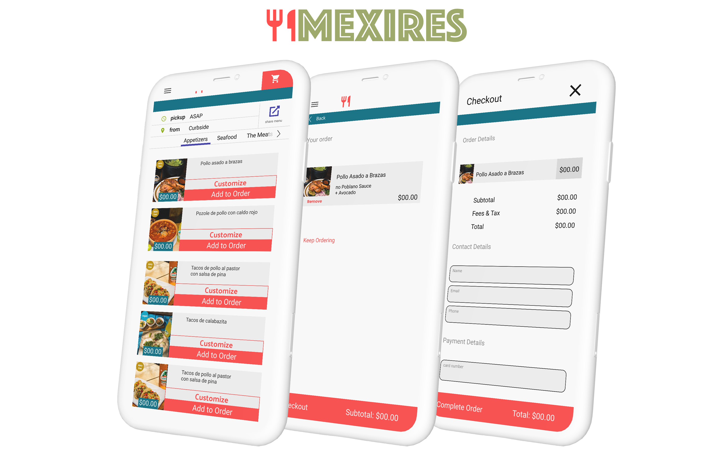
MEXIRES
I conceptualized MEXIRES as an amalgam of my favorite authentic Mexican food restaurants in Los Angeles. My inspiration came from places like La Casita Mexicana, El Patron, La Guelaguetza, and La Placita Olvera street.
Challenge
Restaurant businesses must adapt in response to restrictions put in place due to Covid.
RESEARCH
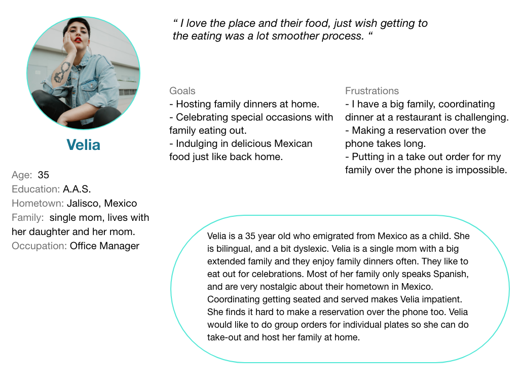
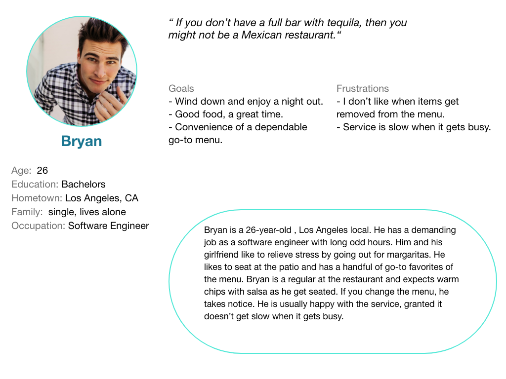
I used several research methodologies to collect data on each facet of the prompt in order to answer the research goals. I held five interviews to understand the Mexires customer. The communication with the participants helped me create two distinct personas and their empathy maps. A primary group identified through this research was working adults with big families who don’t have time to cook meals and like to order takeout .
This user group confirmed initial assumptions about Mexires customers, but research also revealed that time was not the only factor affecting users. Other user pain points included fast changing restrictions due to covid and how that has changed their needs and expectations.
Interviews
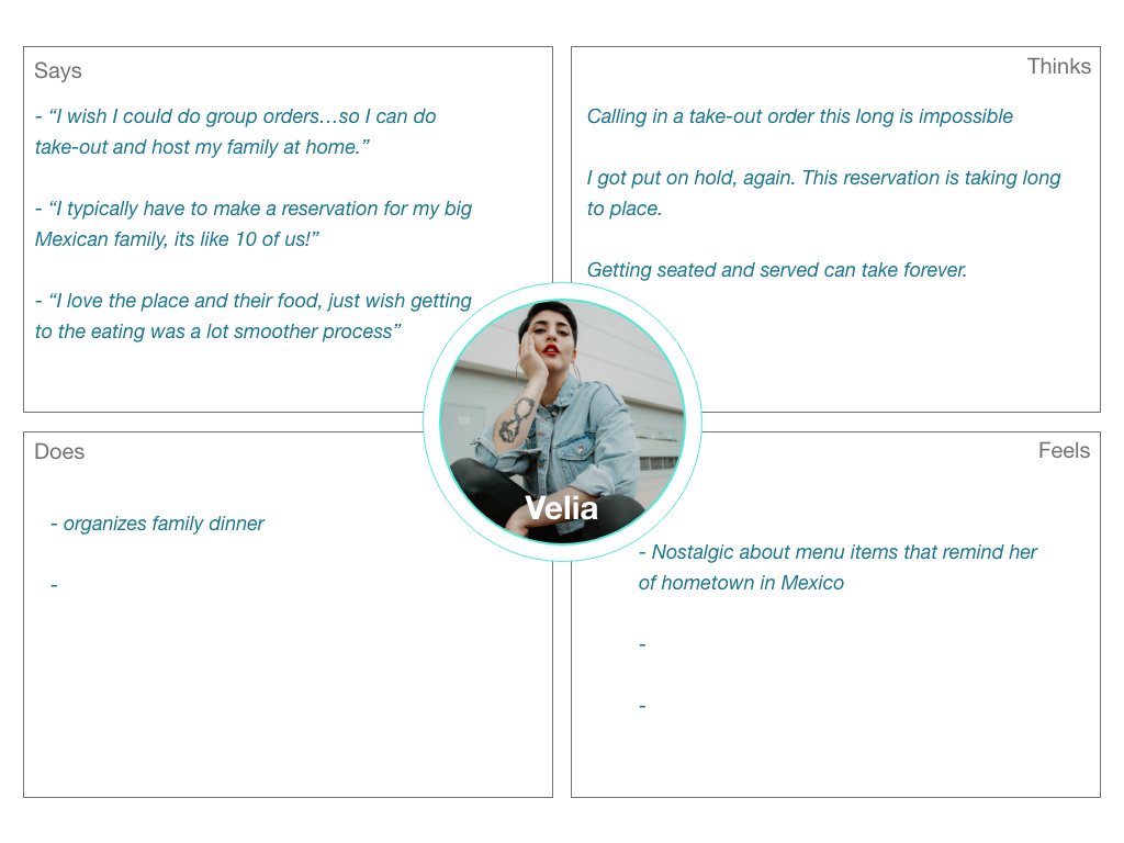
I held five interviews to understand the Mexires customer. The communication with the participants helped me create two distinct personas and their empathy maps.
Customer Journey Map
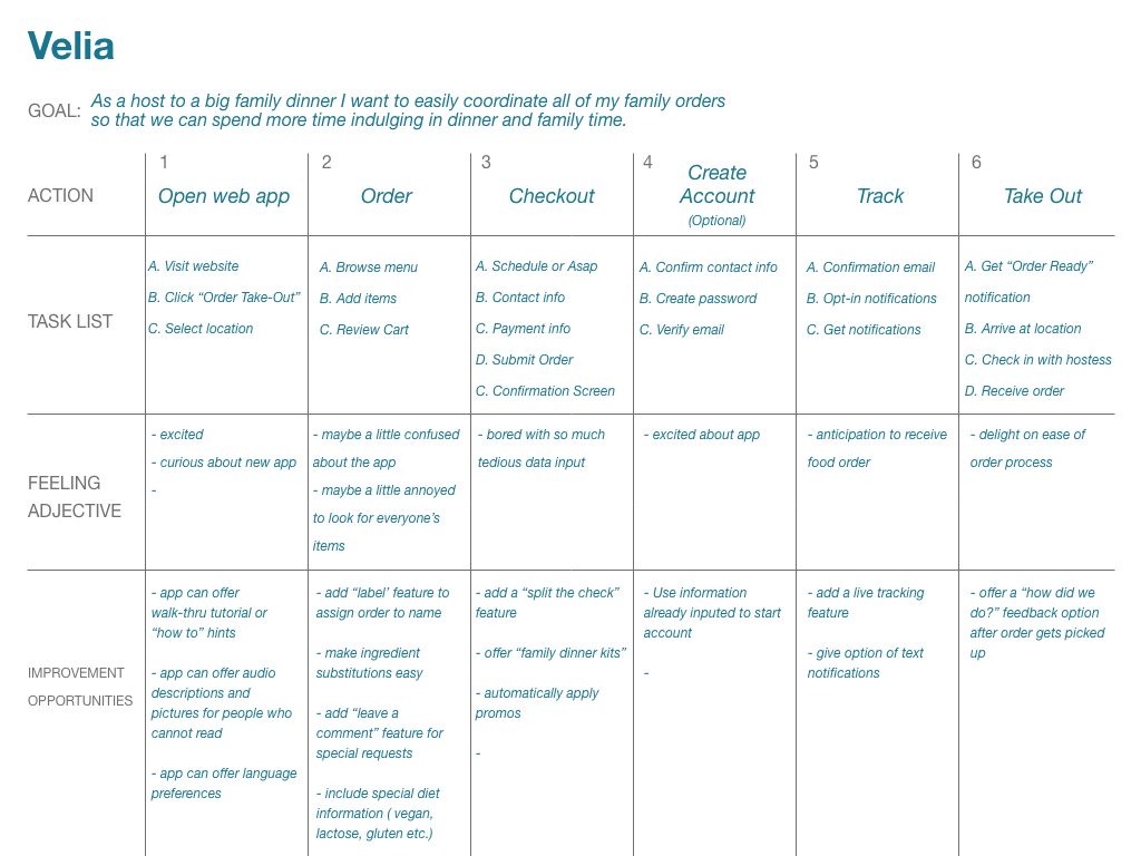
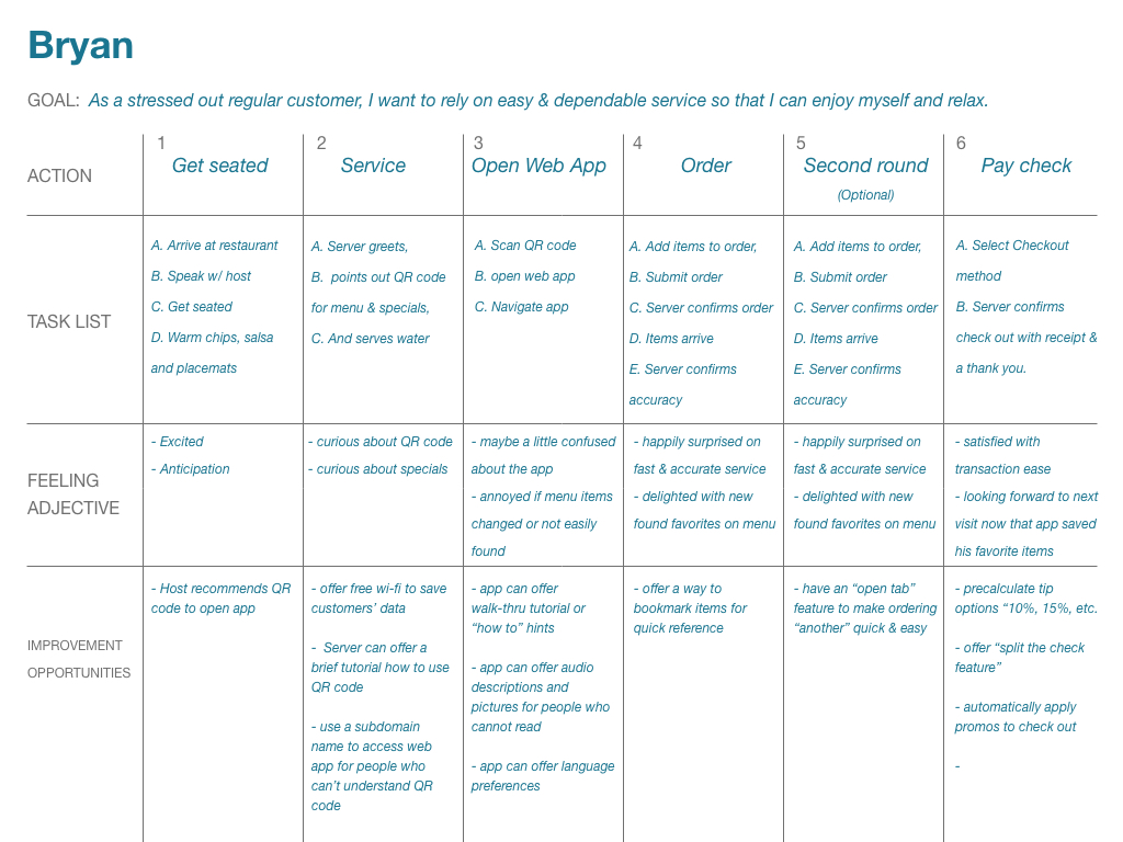
In order to understand the pain points of the product, and the opportunities for improvement I mapped out the customer journey of the two user personas.
Velia
Mapping Velia’s user journey revealed how helpful it would be for users to have the ability to label each item in their order.
Bryan
Mapping Bryan’s user journey revealed how helpful it would be for repeat customers to bookmark their favorite items for quick access.
Personas
Empathy Maps
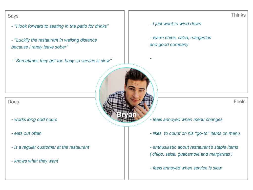
If Velia orders take-out thru the app then she can have more time to host family dinner.
If Bryan uses the app from his table then he can have an enjoyable, contactless dine-in experience.
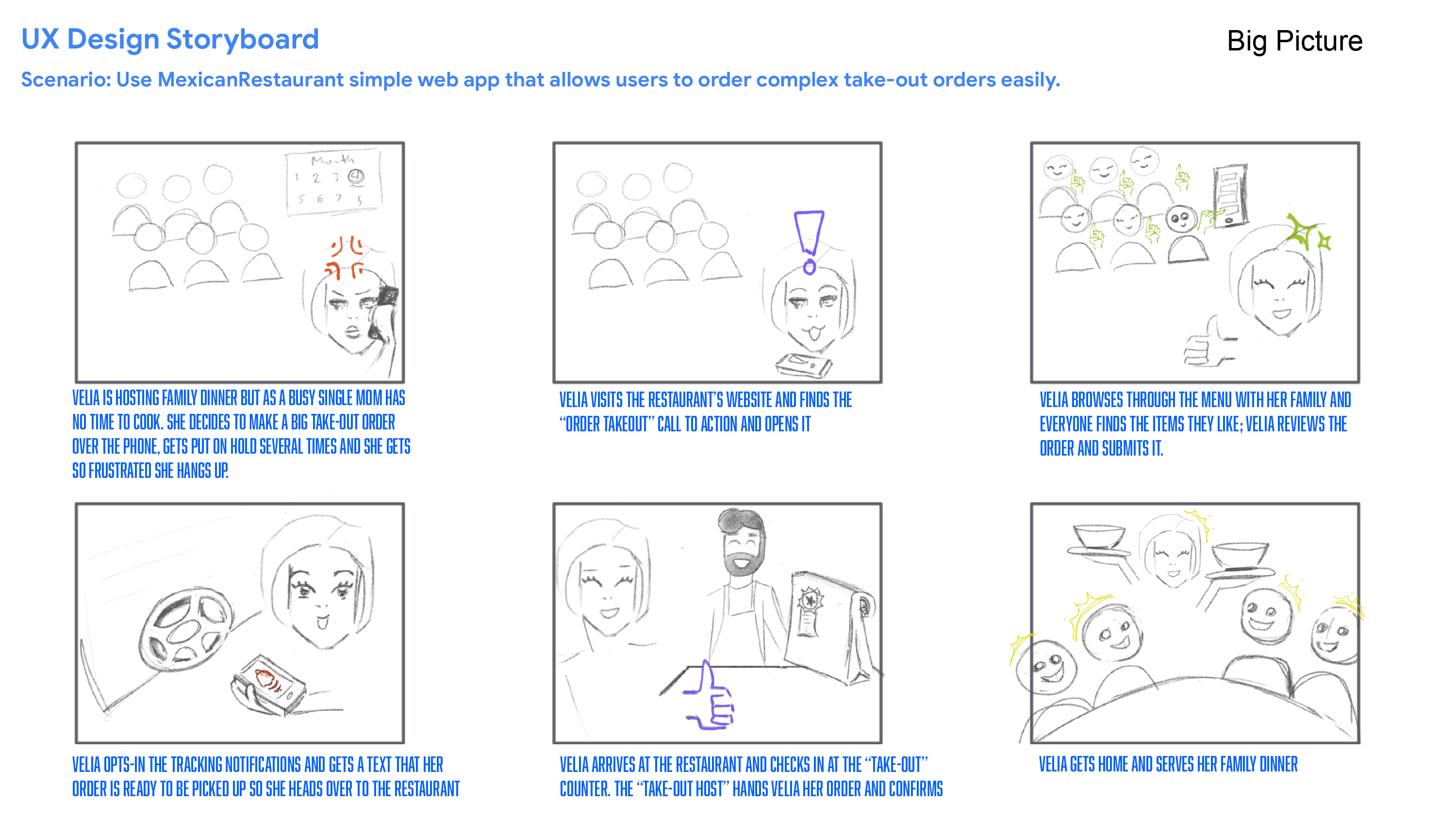
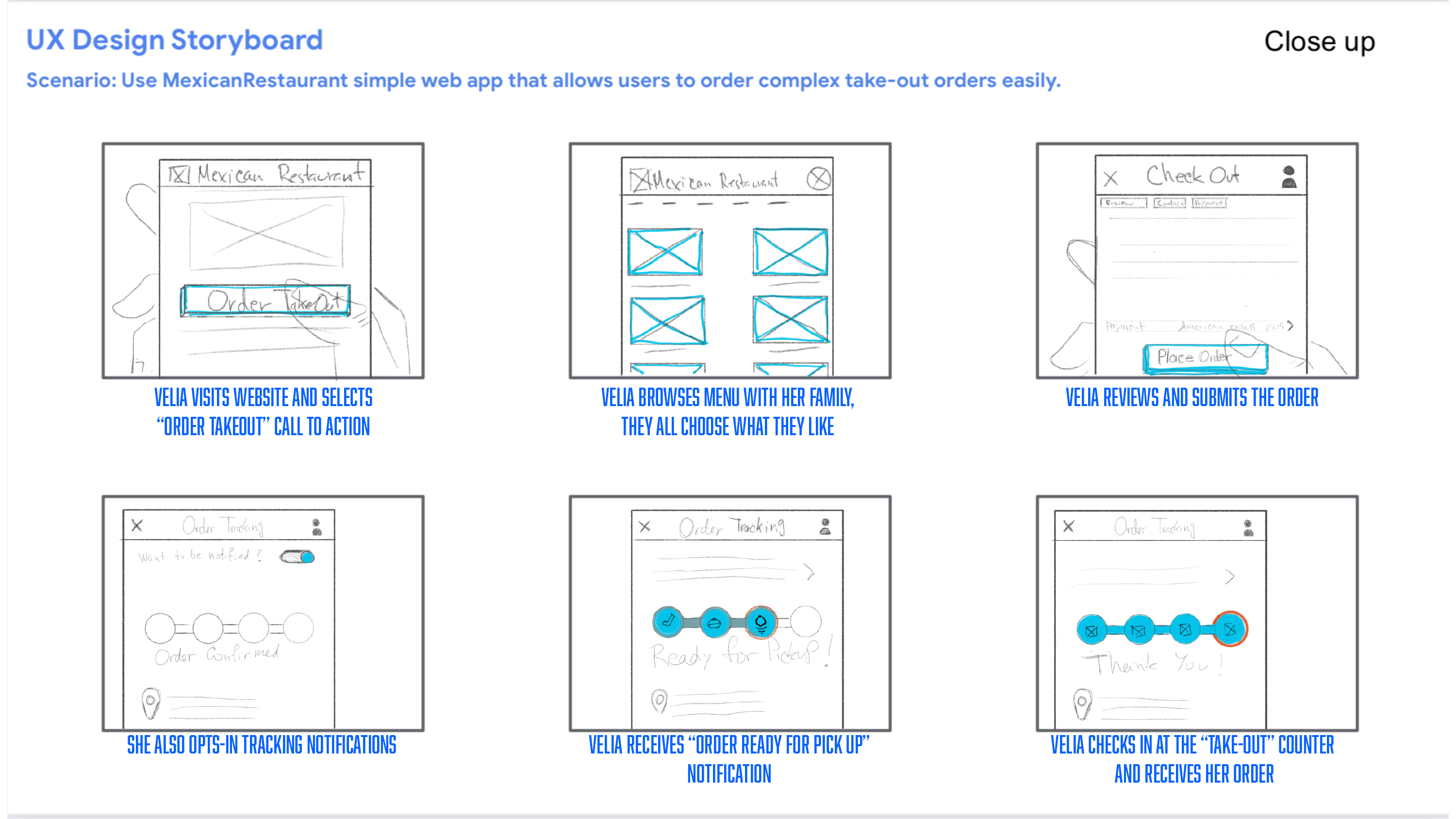
UX Storyboards
To further empathize the pain points of Velia’s take out story , and the opportunities for ideating the product’s offerings, I utilized big picture and close up, ux storyboards.
Pain Points
Time
Working adults are too busy to spend time on meal prep.
Restrictions
Navigating limiting circumstances and fast-changing constraints due to covid is stressful.
Service
What does outstanding service look like in a “contactless” era?
IDEATION
SKETCHES
Taking the time to draft iterations of the app on paper ensured that the elements included in the digital wireframes would effectively address the users pain points.
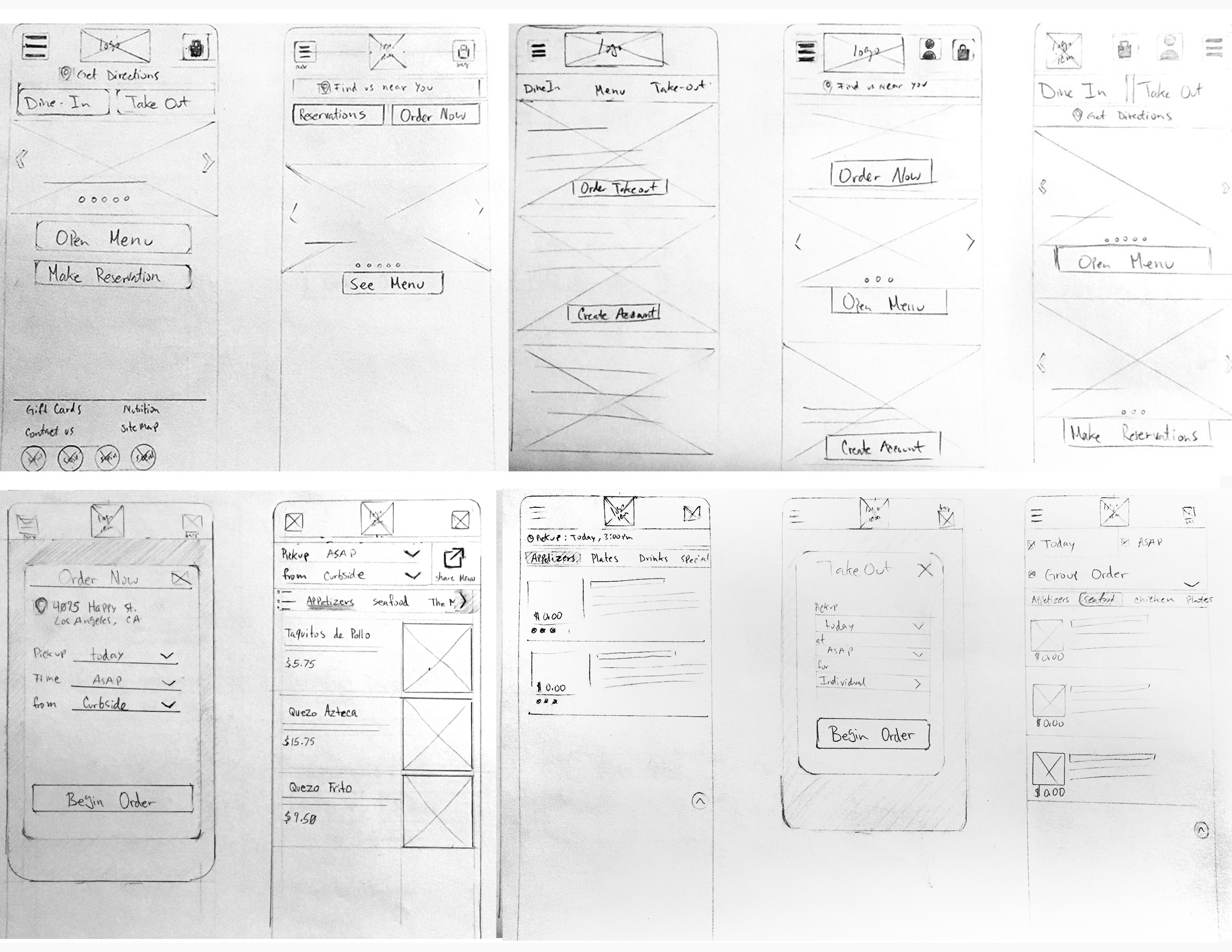
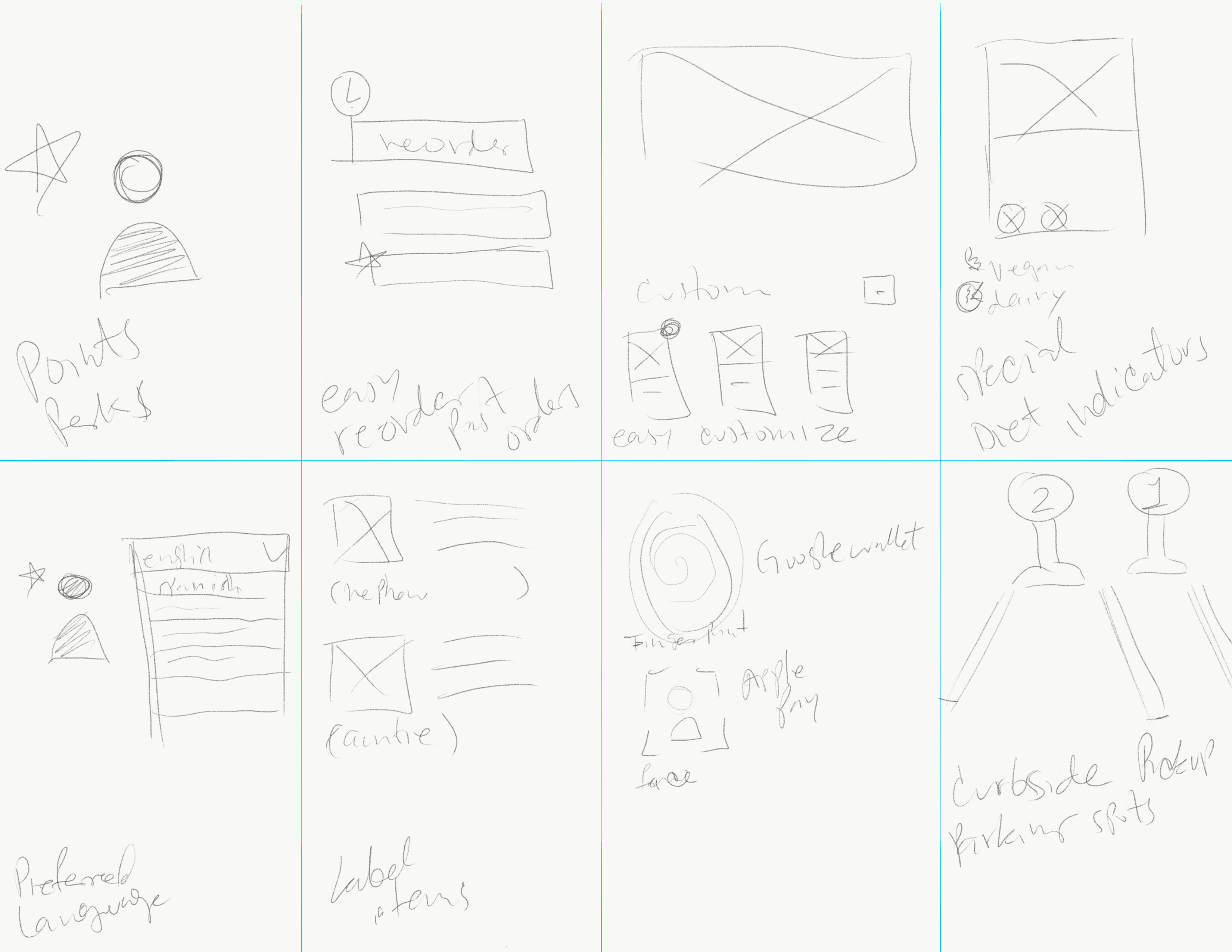
CRAZY 8'S
This ideation exercise was fast paced but very fun. I really enjoyed letting my creativity flow without judgment to come up with some awesome ideas.
Key Takeaways
I conducted two rounds usability studies. Findings from the first study helped guide the designs from wireframes to mockups. The second study used a high-fidelity prototype and revealed what aspects of the mockups needed refining.
Round 1
The checkout process has too many steps. Users need better cues for how to customize an item. Users want write-in labels for their menu items.
Round 2
Users want a curbside pick-up option. The tracking order process is confusing.
WIREFRAMES

DESIGN
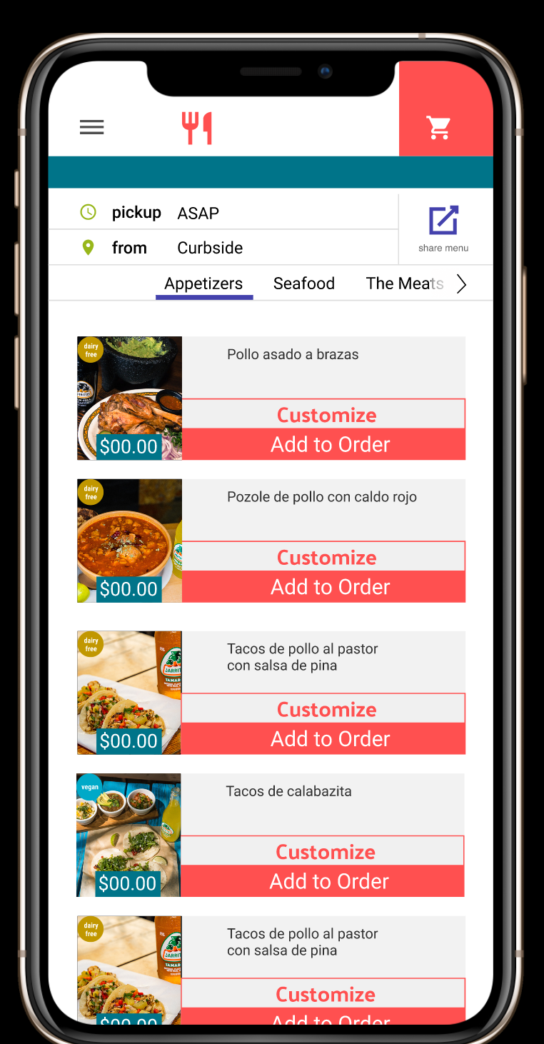
Order
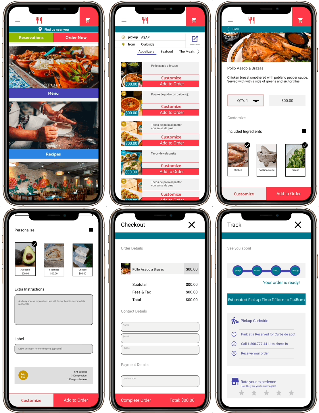
A button for an easy way to share the menu when ordering for multiple people. Diet and nutrition labels to make user’s choices easier at a glance. Clear and comprehensive customization options.
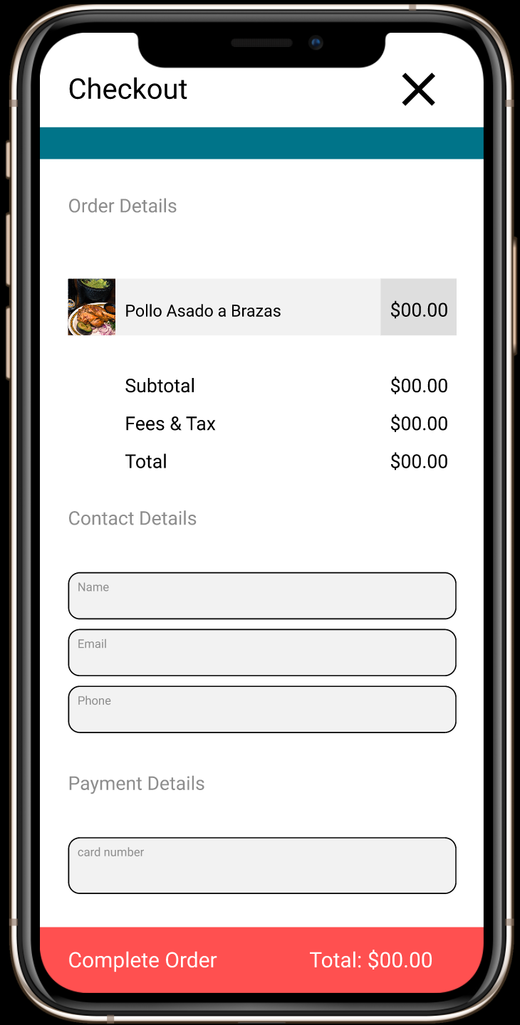
Checkout
A simple and clear cart for a straight forward checkout process.
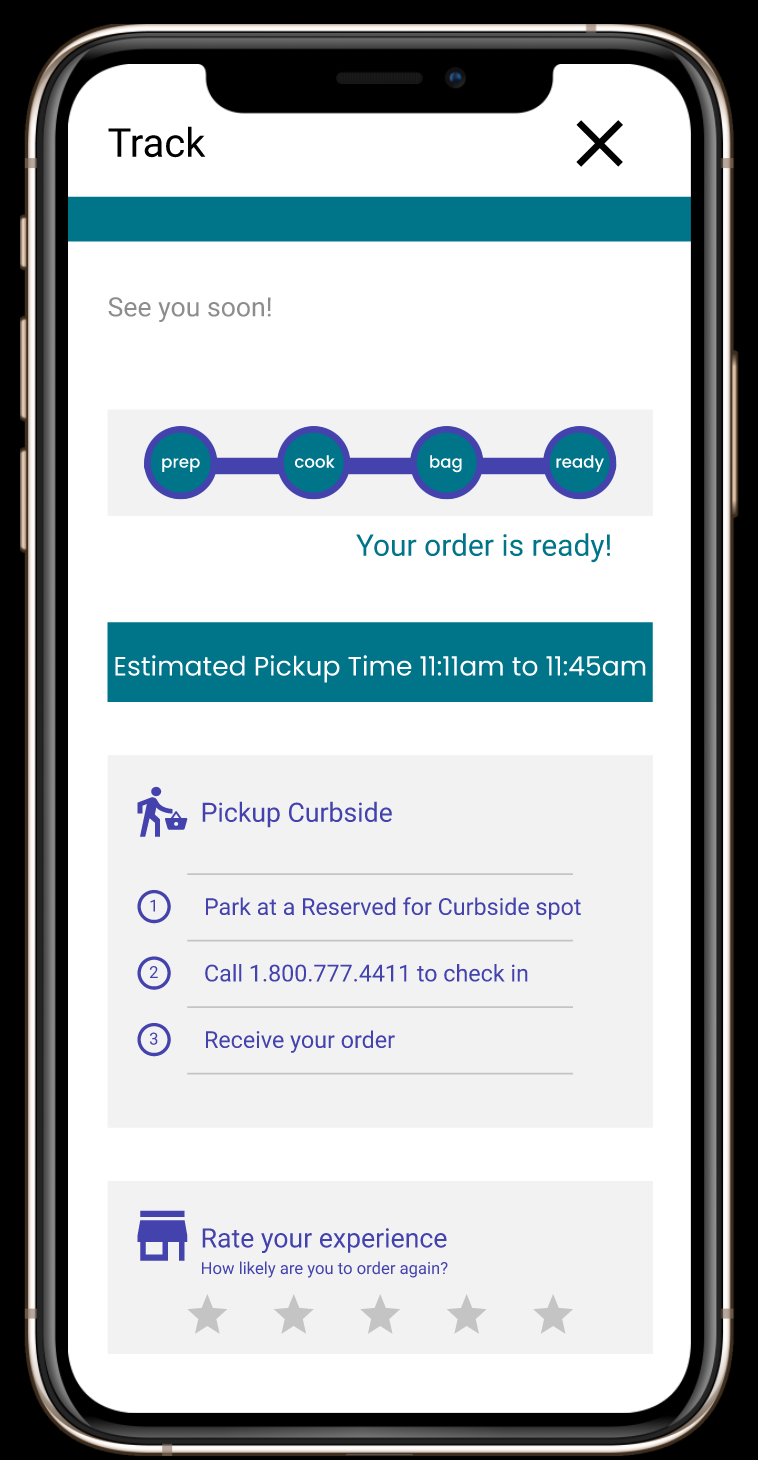
Track
Meeting user needs for tracking their order with text notifications as well as clarity in curbside pickup instructions.
CONCLUSION
Impact
The app makes users feel like Mexires authentically cares about the families that eat there, especially during uncertain times.
What I Learned
While designing the Mexires app I learned the value of user research and usability testing. I really grew from flexing my research muscles during this project and I’m excited to take these skills into the future of my career.
